Capital Forecast
A robust platform for managing and optimizing dialysis treatment for doctors, nurses, technicians, and patients.
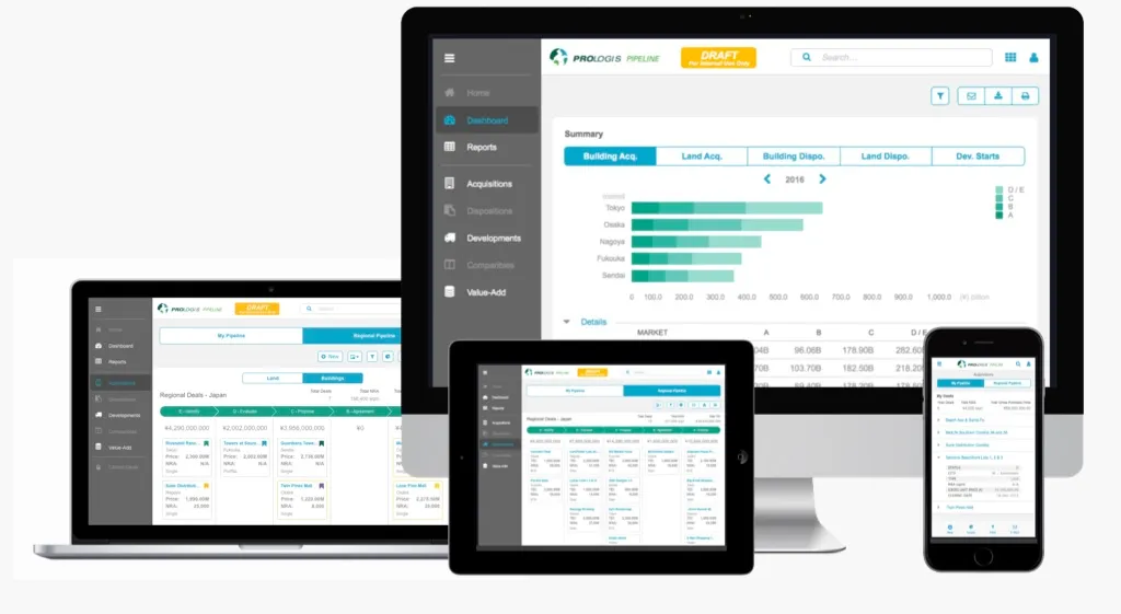
Client
Platform
Timeline
12 months
Design Synthesis
Project Overview
Objective
Capital Deployment is the decisions the company makes about where to spend money; buying, selling, improving, or developing land or buildings. The goal of the Capital Deployment Pipeline (CDP) software was to create a tool to see at what stage these decisions are in, and therefore estimate money flow.
Team
| # | Role | Description |
|---|---|---|
| 2 | Project Managers | Responsible for defining and evaluating the business needs. |
| 1 | Product Owner / Business Analyst | Defined the product vision and roadmap. |
| 1 | Project Manager | Planning and executing the project timeline. |
| 1 | Lead UX Designer | Designing the user interface and experience while maintaining consistency across the application. |
| 2 | Secondary UX Designer (Me) | Assisted the lead designer with wireframes and design reviews. |
| 1 | Internal Technical Lead | Managed the engineering teams and worked directly with the UX team to ensure all designs were technically feasible. |
| 3x5 | External Developers | Three teams of 5 developers each were brought in to build the frontend and backend components of the application. |
My Mandate
| Directive | Description |
|---|---|
| Enhance Usability | Create a mobile deal tracking tool for users out searching for land or buildings in the field. |
| Reduce Time-on-Task | Allow the deals to be recorded, seen and acted upon much quicker than before, ideally reducing the time it takes to close a deal. |
| Enhance Transparency | Create transparency between all branches of the company; from the Field Officers all the way up to the CEO and top executives. |
Discovery
Initial Insights
| Method | Participants | Core Insight |
|---|---|---|
| Subject Matter Expert Interviews | 3 former Field Officers-turned-Analysts | Our first feedback was delivered directly by the subject matter experts themselves, who were able to provide us with a wealth of information about the current process and pain points they were facing. |
| Field Testing (iPad prototype) | 30+ PCTs | Glove-touch failure → average 300 glove swaps per shift per user. |
| Contextual Inquiries (on-site) | 30+ patients observed | Need instant vitals comparison (pre/in/post) without leaving the screen. |
| Working Sessions with Apple | Our UX team along with three UX designers from Apple | We traveled to Cupertino, CA to work directly with Apple’s UX team to get their feedback on the project and how it could be integrated into their products. |
Problems Identified
DATA INCONSISTENCY
SPEED ISSUES
LOST DEALS
"…have we seen one f***ing deals info been right yet? Why do we even spend 2 weeks rollin' the numbers up if we can't use them at all 'cause they're WRONG?!”"
— Executive, SouthWest US District meeting call
Proposed Solution
With the data documented, we returned to the executive stakeholders and suggested we pivot the project to a desktop application or offline-first web-app. Our proposal was that it would simply enhance the functionality of the existing kiosk, but with the added benefit of being able to be used on any device with a web browser, so that nurses and doctors could do certain actions from their laptops or tablets without having to use the kiosk. This was obviously met with a lot of pushback from the executive stakeholders, who wanted to see their dream of a tablet-first solution come to fruition. However, with the full support of both the UX and engineering teams, and most importantly, the users themselves, we were able to push back and get the project approved as an offline-first web-app.
Design
Personas
| User Group | Characteristics |
|---|---|
| Doctor | • Typically visits patients only when needed. • Not always on-site during treatment. • Needs to be able to review historical data and treatment plans. |
| Nurse | • Problem solving during treatment. • Juggling multiple patients and tasks. • High stress environment. |
| PCT | • Focus on efficiency. • Get the patients started on treatment as fast as possible. • Rapidly jumping between patients. • Hygiene-heavy. • High turnover rate. |
Conceptual Framework
| Method | Description |
|---|---|
| Device Discovery | With the executive team on board, we conducted a discovery of the different devices that were available to help us increase the efficiency of the existing kiosks, specifically focusing on larger monitors that could display the maximum amount of information to the user. |
| Flow Diagrams | Created flow diagrams to visualize each core part of the treatment process. |
| Site Mapping | Created site maps to visualize the different pages across the entire CWOW suite. |
| Whiteboarding | Sketched out the different concepts to help visualize the proposed components, focusing on their potential benefits and drawbacks, both from a usability and engineering perspective. |
Prototyping
| Component | Description |
|---|---|
| Design System | Created a modern desktop-first design system (that still maintained best practices for touch interaction) to be used by the entire team across all parts of the CWOW product suite to ensure consistency. |
| Information Architecture | Restructured the existing system for the web app that was more intuitive and easier to navigate. |
| Visual Design | Our UI team worked directly with us and the engineers to create a more consistent and modern design that also showcased the company brand. |
| Device Integration | • Widescreen Monitors: With the current kiosk hardware being extremely outdated, we landed on using larger monitors to display the maximum amount of information to the user. • Mouse Functionality: Added the ability for clinicians to use a mouse to assist in navigating the new UI while learning hotkeys (especially helpful to new users). |
Testing
Evaluation
| Method | Description |
|---|---|
| User Testing | Conducted multiple usability tests across the country with all user groups to ensure the new design was intuitive and easy to use. |
| A/B Testing | Conducted A/B testing to compare the new design with the existing desktop kiosk to determine if the new design was actually faster and more efficient. Additionally, we tested the new designs with the proposed mouse and monitor device integrations to ensure maximum functionality. |
| Feedback Analysis | Analyzed the feedback from the testing sessions with the subject matter experts, engineers, and executive stakeholders to make sure all concerns were addressed and the new design was ready for production. |
"It isn't a straight through process, we just want to get the patient started as quickly as possible, and deal with the extra stuff later."
— Anonymous PCT
Iteration
| Iteration | Description |
|---|---|
| Design System | Altered the design system to have specialized components for Chairside specific features since it functioned differently than the other CWOW applications. |
| Information Architecture | Revamped the information architecture to allow for swappable side-by-side views of the patient’s vitals and treatment steps. |
| Visual Design | The visual design was updated to be larger, allowing users to clearly read the monitor from further away since they were often focused on the patient and not the screen itself. |
| Device Integration | Discovered that a trackball mouse was ideal instead of a standard mouse as the kiosks had very little space for movement. |
Validation
Impact & Outcomes
While I did get to see the success at our pilot location, I unfortunately left the company for my next position before the final rollout of CWOW and Chairside. However, it was extremely well received by the initial test clinics and in talking with my former colleagues in the years since, they informed me that as of 2020 nearly every clinic in the country was using the new software.
~30%
Time-on-Task Reduction
~84%
Training Time Reduction
92%
Adoption
4.87 / 5
Overall Satisfaction
| Metric | Description |
|---|---|
| Time-on-Task Reduction | ~30% per patient, meaning users were able to spend more time treating the patients directly rather than managing the kiosk and patient records. |
| Training Time Reduction | Nearly an ~84% reduction in training time for new PCTs, taking the required supervised training time from 6 months to around 1 month → ≈ millions of dollars saved in labor costs. |
| Adoption | 92% of pilot clinicians rated the app “essential. |
| Overall Satisfaction | 4.87 / 5 stars from dozens of clinicians surveyed across the country. |
Reflection
Personal Growth
This was a challenging project to work on, but it was also a lot of fun. I learned pretty much everything there is to know about dialysis treatment and HIPAA compliance without being a medical professional. I also learned how to balance the wants of the business, the technical feasability from the engineers, and most importantly, the needs of the users. I also learned a lot about the importance of Agile methodologies and how to work with a team to deliver a product on time and on budget. This project remains the one I’m most proud of to this day and I’m forever grateful to have been a part of it.