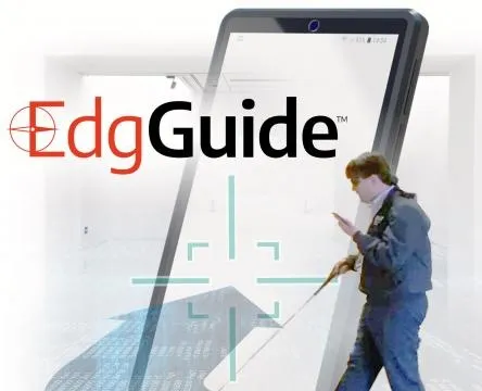
EdgGuide
A mobile navigation and information application for visually impaired users, enabling independent wayfinding in large spaces like museums with minimal, non-intrusive wearable feedback.
Client
Platform
Timeline
6 months
Design Synthesis
Project Overview
Objective
EdgGuide is one of the few public-facing applications in the EdgPortfolio. The goal was to create a mobile navigation and information application for visually impaired users that would allow them to gain freedom in large areas such as museums when navigating exhibits. The solution needed to be minimal and non-intrusive while still providing positive feedback—combining a geofenced location app with detailed exhibit information and a wearable device with haptic feedback so users could experience the museum the way they wanted.
Team
| # | Role | Description |
|---|---|---|
| 1 | Product Owner | Responsible for defining the product vision and roadmap. |
| 1 | Subject Matter Expert | Responsible for providing insights into the needs of visually impaired users and the museum environment. |
| 1 | UX Designer (Me) | Responsible for research, synthesis, design, and prototyping of the mobile app and wearable experience. |
| 2 | Developers | Built the mobile app and wearable device integration. |
My Mandate
| Directive | Description |
|---|---|
| User-Centered Research | Talk with visually impaired users, observe how they use existing apps, and experience accessibility modes firsthand to inform the design. |
| Navigational Clarity | Design a geofenced location app that provided detailed information for each exhibit and a clear navigational pattern aligned with what users already knew (e.g., Apple as the gold standard). |
| Minimal, Non-Intrusive Device | Create a wearable that provided haptic feedback (left, right, forward, stop) without feeling constricting or making the user look different from other visitors. |
The project began as an unexpected idea: an engineer had used location sensors and collars to track his cats at home. Combined with a request from a visually impaired user who was friends with an LGS employee, the question became whether we could take that tracking concept, add haptic feedback to a wearable, and pair it with a geofenced app so that visually impaired users could experience the museum independently.
Discovery
Initial Insights
| Method | Participants | Core Insight |
|---|---|---|
| User Interviews | Several visually impaired users | Asked what apps they use and like; observed how they use them. |
| Accessibility Immersion | UX Designer (Me) | Put my own phone into accessibility mode for a period to experience it firsthand. |
| Market Research | N/A | Overall feedback was that Apple is far and away the leader in this field, which led to research on what Apple had done to pave the way. |
Watching a visually impaired user navigate their iPhone is truly something special and unique. They don’t follow the same gestures that sighted users do; instead they use a series of long drags or holds, followed by a single or double tap when they hear the option they want as it’s read to them. And they don’t have information read at normal speed—the audio is often presented at 4-5x normal speech. They have become accustomed to this and actually prefer it.
Problems Identified
MUSEUM ACCESS
DEVICE INTRUSIVENESS
NAVIGATIONAL MODEL
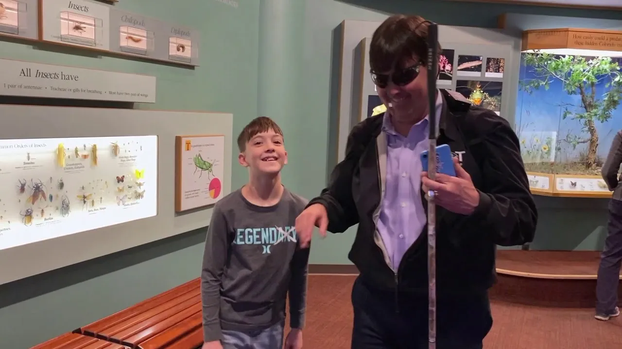
"When my son runs up to a dinosaur at the museum and says 'look, daddy!' I want to be able to experience it the way he does."
— SME, EdgGuide
Proposed Solution
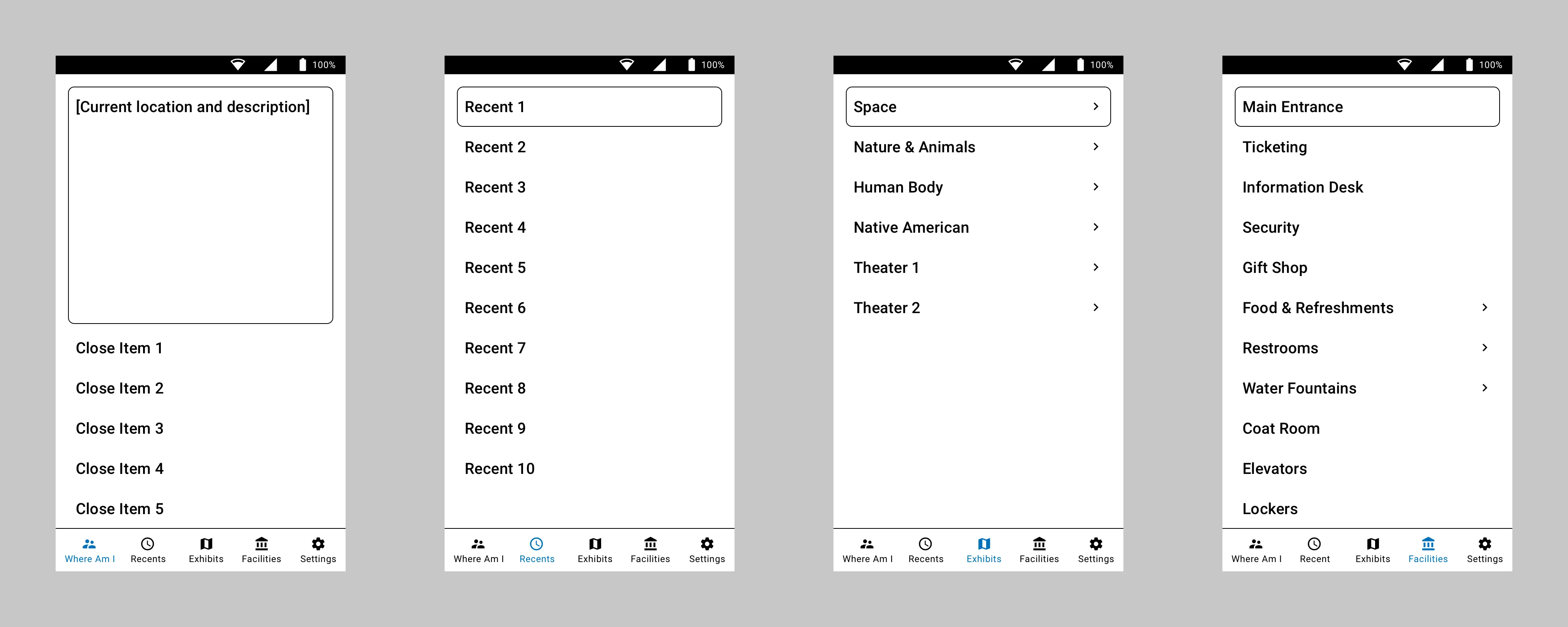
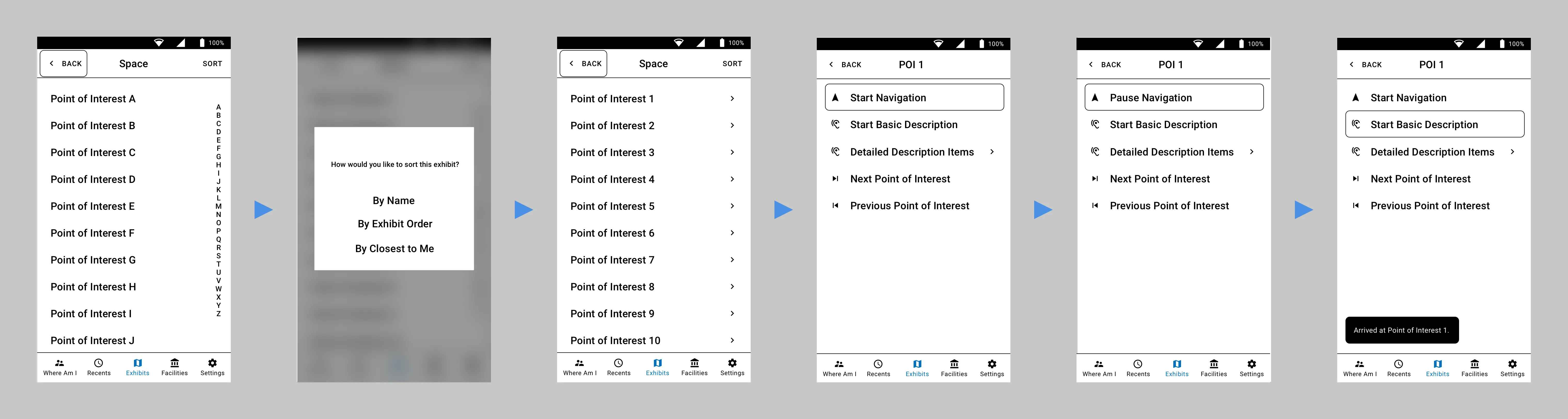
Combine the cat-tracker-style location concept with haptic feedback in a wearable device and a geofenced location app that provided detailed information for each exhibit, so that visually impaired users could navigate and experience the museum independently. The biggest addition was the “Where am I now?” idea: instead of making the user navigate to an exact piece from a list, we reversed the idea and surfaced the exhibits they were standing closest to, so they could begin hearing the description much faster.
Design
Research
| Method | Description |
|---|---|
| User & SME Interviews | Talked with visually impaired users and subject matter experts to understand current apps, preferences, and behaviors. |
| Personas | Defined user groups and characteristics for visually impaired museum visitors. |
| User Journey Map | Mapped the journey from arrival to navigating exhibits and hearing information. |
| Content Strategy | Defined what information to provide per exhibit and how to structure it. |
| Workflows & Information Architecture | Mapped flows and structure for the app (exhibits, areas of interest, facilities). |
Conceptual Framework
We started testing the app with users in our lab to get the navigational portion correct, we also had a wearable device that provided haptic feedback: left for left, right for right, and both pulsing at various speeds to indicate how far forward to move. The original device was worn as a chest rig, which was demoed in the proof of concept video at the Nature & Science Museum in Denver.
Prototyping
Designing for the visually impaired used the base principles of wireframe design as the actual visual design: high-contrast black and white, little or no color. Not all users are completely blind; those with some sight prefer high contrast, larger touch targets, and larger font sizing.
Since users had identified Apple as the gold standard, I looked at which apps they used most often. Contacts/Phone was one of the most common. I took the basic five-button bottom navigation pattern and morphed it to work for navigating a museum—giving users the ability to drill into exhibits, areas of interest, and common facilities like food and restrooms.
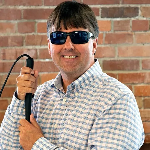
As for the chest rig used in the proof of concet, we knew users didn’t want to feel constricted or look different from other visitors. So the next step was to design a less obtrusive device. We ended up with dual bracelet-style sensors, one worn on each wrist, that provided the required haptic feedback. This, combined with the user’s own headphones, gave the wearer a way to navigate the museum and receive information through the app about exactly what they were standing in front of.
Testing
Evaluation
Testing was done both in our lab and in the museum. We tested the mobile app and wearables with the engineering team first, blindfolding the user and navigating around the lab. We very quickly learned that we cannot mimic how well and independently actual visually impaired users move with the device. Engineers were scared to move at normal speed, fearing the app wouldn’t work and they would run into something. When we had actual visually impaired users test it, they incorporated their walking canes immediately and moved without issue.
PRIVACY
Iteration
| Iteration | Description |
|---|---|
| Wearable Form Factor | Moved from a chest rig to dual bracelet-style sensors on each wrist so the device was minimal and non-intrusive. |
| “Where am I now?” | Reversed the navigation model to surface the exhibits the user was closest to, so they could start hearing the description much faster instead of choosing from a list. |
Validation
Impact & Outcomes
Knowing we had a functioning app and haptic sensors, we began working with the Denver Museum of Nature and Science for real-world usage. The solution is still being tested there, with the hope to expand it across all exhibits in the near future.
85%
Independent Navigation
4.5 / 5
Locational Awareness
4 / 5
Overall Satisfaction
4.5 / 5
Ease of Use
| Metric | Description |
|---|---|
| Independent Navigation | Users were able to navigate and access exhibit information independently with the app and wearable. |
| Locational Awareness | 4.5 / 5 from participants on how well the solution helped them understand where they were and what was nearby. |
| Overall Satisfaction | 4 / 5 from participants on their overall satisfaction with the app and wearable experience. |
| Ease of Use | 4.5 / 5 from participants on how easy the solution was to use in the museum environment. |
Reflection
Personal Growth
EdgGuide was a rare opportunity to design for accessibility in a real-world, public setting. I learned how visually impaired users actually use phones—different gestures, audio at 4-5x speed—and how important it is to design with and for them, not just for them. The shift from a chest rig to dual bracelets reinforced that form factor and “invisible” design matter as much as functionality. Partnering with the Denver Museum of Nature and Science gave the project a real venue and real users, and the “Where am I now?” reversal—from list-based navigation to proximity-based information—came directly from watching users with their families. This project remains a strong example of how a seemingly narrow use case (cat tracker + museum request) can turn into a product that expands freedom and access for users.